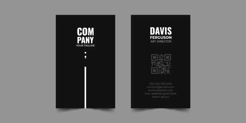
QR Code Black Background: A Complete Guide

QR Codes are everywhere, but how can you differentiate yours from the many black-and-white squares?
Changing the color scheme could be the key to drawing attention to your QR Code and making it stand out.
And you know what? A QR Code black background may work.
In this blog, we’re explaining why a black background is so practical for QR Codes.
We’ll discuss everything from brand alignment and visibility to the introductory psychology of why it looks so awesome.
Are you prepared to use your QR Codes to spark discussions? Let’s get started.
A. How to create QR Codes for a black background

Using Scanova for a demo, here’s how to create a Website URL to QR Code online:
1. Go to Scanova. Click on Create QR Code
2. Select the Website URL category from amongst other QR Code categories.
3. Enter the link you want to encode in the QR Code. You can also go for Advanced Settings in the same step
4. Now, click Continue
5. On the page that loads, name the QR Code and click Create QR Code
6. Next, you’ll see the preview of the QR Code along with the Edit Design button
7. If you click on it, you’ll see two QR Code designs—a Custom Logo and a Custom Background Design. Custom logo design allows you to add a logo and color to your QR Code.
On the other hand, a custom background design helps you place a QR Code on any image. Your QR Code color should be light in contrast to the black background
Note that a customized QR Code helps make your creatives look branded. Hence, serious marketer prefer to design their QR Codes.
8. Once your QR Code is ready, you can preview it after you design it. If everything looks OK, proceed to download.
9. To download the QR Code, create an account. Here, Sign Up to get started with a 14-day free trial.
10. Once you Sign Up, click on the download icon. A pop-up will appear, prompting you to specify the size and format of the QR Code image.
Once you enter the details, click Export
That’s it. Your website URL QR Code is ready to be used on a black background. Simply test it once before you go ahead and share it with the world.
B. Why use a black background QR Code

1. Better visibility
A black background contrasts sharply with the light QR Code design, making scanning easier. This strong contrast helps the code stand out, even in low-light conditions or when viewed on a screen, improving scan accuracy and boosting user engagement.
2. A sleek, modern look
Your QR Code looks sleek and modern with a black background. Many brands like Apple, Nike, and Red Bull use black to communicate sophistication and elegance, particularly in the IT, fashion, and luxury industries.
The black background’s aggressiveness gives your code a more deliberate, high-end appearance.
3. Brand consistency
If your business uses bold or dark colors, a black background helps integrate the QR Code into your design.
Instead of being an afterthought, this keeps the code in line with your brand’s visual design and mixes perfectly with other marketing materials.
4. Increased attention
Black backgrounds naturally draw the eye. Against a dark canvas, the lighter QR Code elements pop, ensuring the code gets noticed.
This can increase the chances of users scanning it, especially when many other elements are competing for attention.
5. Creative flexibility
A black background offers a versatile base for customizations. It lets you play with QR Code colors, logos, or graphic elements without compromising scalability.
The dark backdrop lets vibrant colors and designs stand out, giving you more creative freedom while keeping the code functional.
In the United States, 16 million more consumers are expected to scan QR Codes with smartphones between 2022 and 2025. Source: Statista
C. How does a black background affect QR scanning?

1. Improved contrast
A black background contrasts strongly, making the QR Code elements more distinct. The light QR design stands out clearly against the dark background, which improves the visibility of the code and helps scanners detect it more easily.
This contrast is beneficial in low-light settings or on digital screens.
2. Enhanced scanning accuracy
The high contrast between the black background and the light elements of the QR Code increases scanning accuracy.
Scanners can quickly recognize the code’s patterns, leading to faster, more reliable scans. This reduces the likelihood of scanning errors.
3. Potential for reduced scan distance
While a black background can improve contrast, the distance a QR Code can be scanned may decrease compared to codes with lighter backgrounds.
In some cases, dark backgrounds might absorb more light, affecting how well the scanner can read the code from farther away.
4. Compatibility with scanner software
Some QR Code scanners might need help with codes that have dark backgrounds, particularly older or lower-quality scanners.
However, most modern devices and apps are designed to handle these color schemes without issues.
Scanning should be seamless if the QR Code design maintains enough contrast.
5. Color adjustments may be needed
The color of the QR Code itself is essential when using a black background. The code elements, such as white or light pastel colors, should be light and bright for optimal scanning.
Dark-colored QR Codes on a black background can reduce the contrast, making scanning more difficult.
In short, a black background can improve the overall visibility and accuracy of QR Code scanning.
Still, ensuring the code design maintains strong contrast and is compatible with the scanning device is essential.
Research shows that India’s QR Code payment transactions are set to double from $62 billion in 2022 to $125 billion by 2026, fueled by its national QR Code standard and declining cash use. Source: juniper
D. Choosing the right QR Code colors for a black background

Creating a QR Code for a black background requires careful color choices. The wrong colors can make it hard to scan, which defeats its purpose. Here’s how to choose colors that work well and ensure scannability:
1. Use high contrast
Contrast is the most essential factor. Choose colors like white, pastel shades, or light gray for the QR Code elements. These colors pop against a black background, making it easier for scanners to detect the code quickly.
2. Pick complementary colors
Select colors that not only look good but also maintain functionality. Shades like light gold, silver, or neon work beautifully with black backgrounds. These colors add a modern, eye-catching touch while staying clear for scanning.
3. Try gradients carefully
Gradients can add depth and style, but they require precision. Use gradients with lighter tones that don’t fade too much into the black background. Always ensure that the QR Code’s design stays clear and distinguishable.
4. Add an outline for visibility
If your QR Code includes darker shades close to black, consider adding a thin, light-colored outline around it.
This small detail separates the black background, ensuring scanners can easily detect the code.
5. Test it on multiple devices
Before finalizing your design, test the QR Code thoroughly. Use different devices and test under various lighting conditions.
This helps ensure the code scans well, whether displayed on a screen or printed on a surface.
What our customers say about us:
E. Real-world examples: QR Code with black background

1. Apple event invites
Apple frequently uses minimalistic black backgrounds for its event promotions. QR Codes on digital invites or posters link directly to live streams, event schedules, or registration pages.
The light-colored QR Codes contrast sharply with the black and align with Apple’s clean and premium branding.
2. Spotify music posters
Spotify integrates QR-like codes, called Spotify Codes, on its dark, music-themed posters. These are often used for concerts or playlist promotions.
For example, scanning a neon Spotify Code on a black poster might take users to an exclusive playlist featuring the concert artist or genre-related tracks.
3. Tesla promotions

Tesla uses black backgrounds in its product launch promotions, keeping the aesthetic futuristic and clean.
QR Codes in light colors direct users to event registration pages, detailed specs of new models, or videos showcasing Tesla’s innovations. This approach blends tech-forward design with usability.
4. Nike campaigns

Nike uses dark-themed posters and in-store displays for campaigns. The QR Codes, often in white or neon shades, lead users to exclusive product drops, behind-the-scenes videos of athletes, or AR filters to test products virtually.
The contrast highlights Nike’s bold and innovative approach.
5. Red Bull music events
Red Bull’s edgy nightlife and music event promotions often use black-themed posters with bright neon QR Codes.
These codes link to event lineups, ticket purchasing platforms, or curated playlists, matching the vibrant energy of their brand and audience.
6. Samsung Galaxy ads

Samsung integrates QR Codes into black-background ads for Galaxy smartphones and tablets.
These codes provide access to AR product demos, pre-order pages, or detailed guides showcasing new features like cameras or processors. The dark theme emphasizes the sleekness of their technology.
7. Star Wars packaging by Disney
Disney uses black-themed packaging for its Star Wars merchandise, featuring light-colored QR Codes.
Scanning the codes unlocks trailers, behind-the-scenes footage, or AR content such as lightsaber effects. This brings an interactive, cinematic experience to fans.
F. Best practices: QR Code black background

QR Codes on black backgrounds can be stylish and practical if designed properly. Follow these best practices to ensure they are easy to scan and look great.
1. Use high contrast
Choose light colors like white, light gray, or gold for the QR Code. These stand out against the black background and make the code easy to scan. Avoid dark QR Codes, as they blend into the background.
2. Stick to the standard format
Don’t reverse the usual color scheme. Most scanners work best with light QR Codes on dark backgrounds, not the other way around.
3. Keep it simple
Too many designs or patterns can make the QR Code hard to scan. Keep the code clean and straightforward to maintain its readability.
4. Use a clear quiet zone
Ensure there’s enough blank space (quiet zone) around the QR Code. This helps scanners read the code. Use a light color, like white, for the quiet zone.
5. Test before finalizing
Test the QR Code on different devices and lighting conditions to ensure it scans. What looks good on screen might not work well in print or under low light.
6. Add a subtle outline
If the QR Code blends with the black background, add a thin outline in a light color. This can help scanners detect the code more easily.
7. Use vector files for print
For print, use vector files like SVG or EPS. These files stay sharp and clear, even when resized for different materials.
8. Place it carefully
Don’t place the QR Code where shadows, reflections, or folds could block it. Make sure it’s easy to scan in any light.
9. Test across devices
Check that the QR Code works with various scanners, including smartphone apps. This ensures a smooth experience for all users.
G. FAQs

1. Why use a black background for QR Codes?
A black background looks sleek and modern. It works well for luxury brands or designs that need a bold, stylish touch.
2. Will scanners read QR Codes on a black background?
Most modern scanners will work if the QR Code has enough contrast with the black background. Test it to be sure it scans well on different devices.
3. Can I add a logo or image to the QR Code?
Yes, but keep it simple. Make sure the logo doesn’t block parts of the QR Code. The code must stay easy to scan.
4. How do I test my QR Code?
Scan it with several devices in different lighting. If it’s for print, test it on the final material to ensure it works.
5. Can I use gradients or patterns in the design?
You can, but don’t overdo it. Complicated designs can make the code hard to read. Always test the code after adding any design.
6. What if my QR Code doesn’t scan?
If it’s hard to scan, adjust the contrast. Use lighter colors for the code and clear any clutter from the quiet zone around it.
7. Can I use black backgrounds to print QR Codes?
Yes, they work great for posters, packaging, or cards. Use high-contrast colors and sharp vector files for clear printing.
8. What size should my QR Code be?
The QR Code should be at least 1 inch (2.5 cm) wide for print. Bigger is better if it will be scanned from far away.
Brands that trust us:
Summing Up
QR Codes on black backgrounds aren’t just functional—they’re a statement. They scream sleek, modern, and professional while giving users instant access to what matters.
The secret? Keep it simple. High contrast, clean design, and a clear purpose are your winning combo. Test your code, place it smartly, and pair it with a solid call to action.
When done right, a QR Code on black doesn’t just look good—it works. It connects your audience to value in seconds. So, what are you waiting for? Start creating QR Codes that pop and perform!

