Visiting Card Format: Everything About Designing A Business Card

You know what a business card is and you now want to design one. This could be for yourself or for your employees.
You want to design your business card. This could be for yourself or for your employees.
The purpose of a business card is to help you network better. So while designing one, you must make sure that it looks both professional and creative.
This will help your business card to catch the recipient’s eye. And increase the chances of your contact being saved on their phone.
So it becomes very important to know what all to include in your business card. And how to format it.
And in this article, we will show you how to make an ideal business card.
A. What to include in a business card
Making a business card is simple and easy. But it’s not only about your contact information.
You obviously want your business card to be referable. And to achieve this, here are some things you need to know about visiting card format:
1. Highlight skillset
It is very important to know the purpose of your business card. Established businessmen are generally selective of who gets information regarding their phone number and job title. And hence strategize details accordingly.
Including a few of your special skills on a business card will let people know what your expertise is. But do not squeeze in a whole resume as that will make your business card overwhelming.
For example, say you are a graphic designer who is well versed with the latest technology. So, you can mention special skills such as excellent IT skills with design and photo-editing software on your business card.
2. Put updated contact information
A business card with incorrect contact information is useless. If you are switching jobs, make sure that the business card has updated information.
Also try to give as many contact details as possible such as email ID, phone number, business location, and social media accounts to connect with. Provide a Virtual phone number to stay connected with your customers 24/7 and not lose out on potential prospects.
3. Keep it simple
Readability is the key to an ideal business card. Do not use card formats, which are overwhelming. And makes it impossible to see where one piece of information starts and ends.
4. Make your business card hi-tech
You usually add a website to your business card. This is to provide helpful content about your business. But how many people do you actually think type your website on their browser and then search for you? Not many, right?
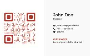
And by adding a QR Code, you can make your business card actionable. QR Codes are advanced barcodes, which are easily scannable with a smartphone (via native camera or third-party scanning apps).
There are two ways you can do this:
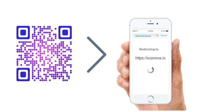
a. Website URL QR Code

All you need to do is link your website in a QR Code. Upon scanning, your clients will be redirected to your website.
And in case, you do not have a website and want to provide useful content.
Now, how do you do that? Here is the second way.
b. Rich Text QR Code
A Rich Text QR Code links to a landing page provided by the service provider that can host unlimited information.

In the landing page, which is linked to a QR Code, you can add multiple layers of information such as text, graphics, social media sharing handles, buttons, and images. Plus, you can format the content the way you want to.
For example, you can write a welcome note and add buttons with multiple URLs such as Homepage, Pricing, and Support on a single mobile-optimized landing page.
You now simply need to print this QR Code on your business card. And write a help note such as ‘Scan to know more about us’.
Another thing is you can customize the QR Code by adding your brand logo and color. This practice will definitely attract more scans.
Custom QR Code
Custom QR Codes attract 50%-200% more scans than generic black-and-white ones. So, if you want to maximize the number of scans, consider adding design to the QR Code.
Upon scanning, the end-users will be redirected to this page.
Another advantage is you can actually track the scanning activity of QR Code. And get data based on date, district, city, and device from which the QR Code was scanned.
In addition to this, you can also see how your end-users are interacting with the encoded content after scanning the QR Code. For example, are they interacting with the Visit Homepage button, Pricing button, or even Support button once they scan the QR Code.
Further, you can even edit the content encoded in a Rich Text QR Code anytime you want. And to do that, you won’t have to recreate the QR Code. This is possible because the Vcard QR Code is dynamic in nature.
Adding a QR Code will make your business card tech-savvy and modern. And also help your clients to easily access your website.
So keep the above things in mind while designing your business card.
Also here is a tip: Always carry a good number of business cards with you all the time. It is unprofessional to suddenly run out of business cards in the middle of a meeting.
For example, if you are attending a conference of 1,000 people, then bring about 200 business cards with you.
Plus, always keep a stack of business cards in your car. This will help you grab them just in case you run out.
B. How to format your business card
In this section, we will detail on how to format your business card to make it the ideal one.
1. Standard size and dimensions
Most standard visiting cards are landscape and rectangular. Sizes and shapes may vary. But your business card must fit the ideal standards. This is important to make sure that it prints correctly.
Standard dimensions for business cards in the US are 88.9 x 50.8 mm (3.5 x 2 inches).
And those for business cards in Europe are 85 x 55 mm.
In case, you want a vertical visiting card, you simply need to switch the page width and height. It will ensure that you don’t have to rotate the card to see the design every time you make edits.
2. Add adequate bleed area
The bleed area is the region, which runs over the trim edge that marks the final size of a business card. Or it is the region that goes beyond the edge of your design.

You must make sure that the bleed area in your visiting card format is 3 mm (0.12 inches) wide. This is important to ensure the perfect printing of cards.
In fact, keep the bleed area color the same as that of the background. This will ensure that the bleed area is not distinctly visible after actual printing. Also, make sure that the document page size is equal to the card size plus the bleed area
3. Organise visiting card elements
Decide what elements you want to include in the business card. Here are the important elements that are a must on your business card:
-
Name of business
You can write the name of your element either in text form or can be displayed prominently in the logo.
-
Tagline/brief description
Adding a tagline is a great way to brand your company. You can create a tagline using tagline maker.
You can write it in Italics to highlight it on your business card.
-
Address
If your company has a physical outlet, mentioning it will prove incredible. If you are an online service provider, then including your email address will be enough.
-
Website address
You can include your website address with or without the preceding URL (https://).
-
Contact information
It is important to give your name, phone number, and designation on your business card. But typing your contact details and adding them to their phonebook can be tedious for the clients.
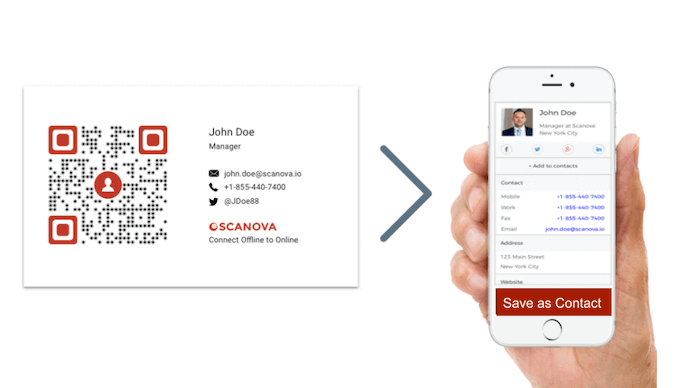
A Vcard QR Code added to the business cards can make the task easier. As recipients scan it, it prompts them to save you as a contact with a single click.

This means they don’t need to tediously type your contact details on their phone. All that they need to do is—scan and save.
This makes your business card hi-tech. And also helps you network better by making it easier for your recipients to save you as a contact.
For more information, you can refer to this detailed guide.
So, once you finalize visiting card elements, design a text and visual hierarchy to set an appropriate visiting card format.
Think where you’d like the recipients’ eye to land first. And plan a hierarchy to systematically guide them through your details.
4. Make sure the font is legible
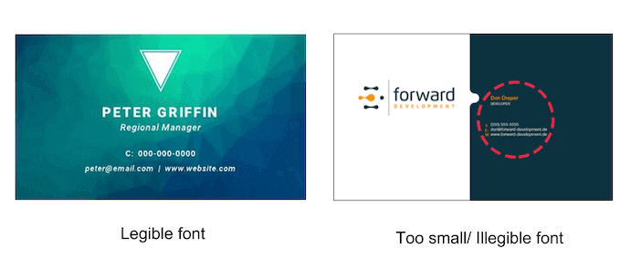
This is one of the most important aspects of a visiting card format. You must make sure that the font is large enough to be legible.
The best practice is to keep the details larger than 12pt font. And always avoid using a font size smaller than 8pt.

The ideal fonts to use on a business card are Helvetica, Myriad Pro, Glasgow, and Karat.
You can also use thermography, embossing, and foil stamping printing processes to make your card visually appealing.
Here is a tip: If you are in the Human Resource department, you can outline the text, which will remain the same (such as company name). And leave the editable text (such as employee name) as such.
5. Create a striking design
Use creative visuals to make your business card stand out. You can do it by making your visiting card design minimalist, hi-tech, or even conceptual.

Just keep in mind which industry you’re targeting, and choose your visiting card design accordingly.
For example—elegant designs work the best for industries such as jewellery and wine.
6. Finalize the material
The material of your business card actually helps build your brand image. So think about the material you want to print your business cards on.
You can print it on:
- Paper: You can use thick, matte, or even glossy paper. And experiment with numerous colors
- Plastic: Transparent plastic visiting cards are one of the latest visiting card design options today. They’re durable and waterproof. And diffuse as light passes through
- Stainless Steel: Stainless steel visiting cards have more unique cuts or designs as their edges are tough and don’t rip out that easily
- You can also use anything like steel, wood, or even fabric. Just give your business card a one-of-a-kind look
That’s it. That is all you need to know about visiting card format. You can now create your own visually appealing and tech-savvy visiting card in order to catch the recipient’s eye.
Still have queries? Let us know in the comments section.